How do you expose for skin tone correctly? The camera’s light meter doesn’t always get it right especially if you have people with different skin tones all in the same image.
In this episode, Gina and Valerie focus on the exact steps you need to take to ensure that everyone’s skin tones come up perfectly. They explain what colour balance is and why you need to understand what it does and how to ensure you have the perfect exposure in your shots regardless of the situation you’re in.
#ginachallenge #skintone
Click play to listen to the podcast or find it on iTunes here. If you don’t use iTunes you can get the feed here, or listen to us on Stitcher radio.
Show notes
Listener question
Follow up question to last week’s question about shooting headshots for a spa.
Andrej Valko (UK) asks:
“Would it be possible to touch on the value and the pricing for such service. I know this depends on many factors but I’d love to hear about how to approach this (within the realm of team headshots) and possibly also the need to emphasise the benefits of great headshot photos (and thus increase the value of the photoshoot – especially if the competition drives the price down). Depending on the budget, this may go hand in hand with time one spends on the whole operation so the additional question is what the typical (and reasonable) time period per person is (that we can try to negotiate with a company). From personal experience I know that sometimes less than 5 minutes per person is sufficient and other times even half an hour may not be enough. Let’s say that a company restricts the time too much (even after the discussion and negotiation) – should we go for it and hope for the best, possibly having to lower our standards and risk bad reputation or decline to shoot? I know that this, again, depends on the actual circumstances, personal approach and “feeling lucky” state of mind but I was wondering what you would suggest for us who are starting out and need just about every shot that is released “to the wild” to be as good as possible. Many thanks!”
We answer this in the episode!
Photo critique
Images by Sharon Ouliaris (Melbourne)

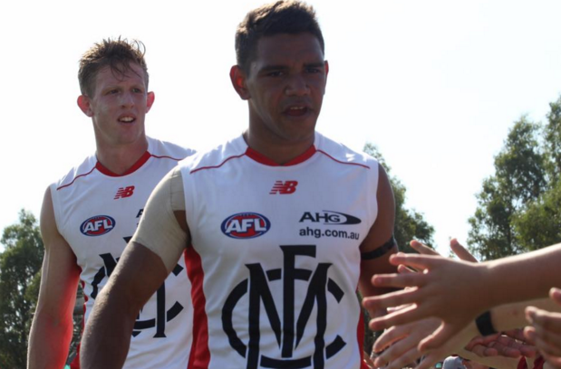
Above: Shot by Sharon Ouliaris
“I am doing photography for one of the AFL TAC cup teams and was lucky enough to be given the opportunity to shoot an AFL NAB cup game. Melbourne v Western Bulldogs. Loved the player’s interaction with the crowd after the game. Here are two of my shots. Constructive criticism welcome.”
Gina and Valerie discuss this in the episode.
How to expose and colour balance skin tones
Listener question that inspired this podcast:
Kerri Setch says:
“Thanks Gina Milicia for another enlightening episode. As it’s footy season and I switch into Weekend Warrior of Sports Photography with my son’s footy team I was just wondering if there is a general rule of thumb for groups of varying skin tone (see pic for the variety). The game is fast and light varies a lot. I tend to shoot Av and vary ISO to keep speed up for sharper images. Or, is metering for this a whole other ballgame!”
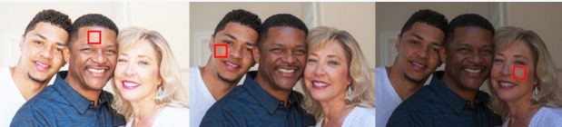
ABOVE:
- The skintone of the son (camera left) is the most neutral or closest to mid grey in tone so this is the best skin tone to take an exposure reading from.
- The darker skin tone creates an overexposed reading
- The lighter skin tone creates an underexposed image
Colour balance vs exposure
- Colour is created by reflected light
- To see colour there needs to be light
- When light hits an object some colours bounce off the object and others are absorbed. We only see the colours that are reflected from the object
- Morning light is blue reflected light
- Evening is warm reflected light
- If you are in a room lit by flouro lighting you will see green or magenta light
- A house lit with tungsten (old school lights) is very warm
- The colour tone in an image can have a huge impact on the mood
- Too much red in a photo can make skin tones look dreadful
- Too much blue and people look half dead
- If you are still getting your head around light and exposure then start to be aware of colour
White balance
- This is a name of a process that removes colour casts from images to create a neutral image.
- The colour is balanced.
- Our eyes are really good and calibrating colour and removing casts in light.
- That’s why you don’t notice blue light in the morning
- Cameras do a pretty good job with auto white balance.
- Basically the camera can be set to automatically set WB (find a neutral colour or no cast)
Light can be measured by colour temperature or kelvin
Colour Temperature – Light Source
1000-2000 K – Fire/Candlelight
2500-3500 K – Tungsten bulb (old school)
3000-4000 K – Dawn/Dusk(no clouds)
4000-5000 K – Fluorescent Lamps
5000-5500 K – Flash
5000-6500 K – Daylight sunny (no Clouds)
6500-8000 K – Thin cloud cover
9000-10000 K – Overcast
- Cameras have auto preset buttons to cover most of these conditions
- So if you are shooting a group of people sitting in a house lit by tungsten set camera to tungsten
- Shooting in a shopping centre set camera to fluoro
- Flash outside on a sunny day = Flash
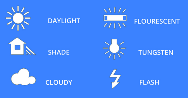
Above: Auto White Balance Icons for DSLR cameras
- Exposure is how light or dark your image is
- White balance or colour balance is about the colour cast of an image
- An image with correct WB is all about achieving a white in the image that looks Neutral
- If you shoot under flouro lights with white balance set to daylight, the image will look green or magenta
- If you set your WB to flouro the cast will be gone
- If I shoot in a house with old school tungsten bulbs the light is very warm or has a yellow cast
- If I change my WB setting to tungsten I’ll then have a more neutral image
Auto white balance
- This is when you let the camera decide and it’s great when you are starting out.
- When you are ready to step up a few notches or working for designers/magazines/art directors/ advertising agencies custom white balance gives a more accurate white balance

Above: None of the custom settings worked in these extreme conditions

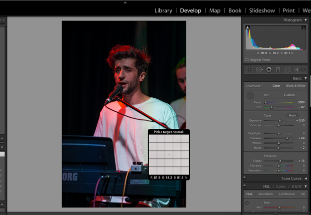
Above: WB set to custom by selecting a neutral tone in post production
Custom white balance
- When you are ready to step up a few notches or working for designers/magazines/art directors/ advertising agencies custom white balance gives a more accurate white balance.
- Photograph a mid grey card in the light you will be using. Set your WB to this setting for the remainder of the shoot.
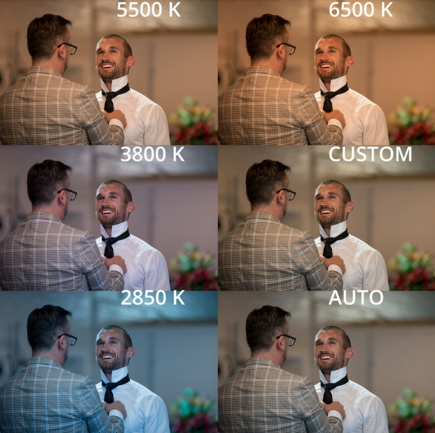
Above: Changing custom WB settings can radically change the look of your image
My process
- I set my colour temp to 5200 which is a good representation of daylight
- I shoot in RAW
- If colour is crucial (product/advertising/skin tone) I use a grey card to create a neutral base
- Adjust WB in Post
- If I forget I select a neutral tone in the image
- Look for a good white (not blown out)
- Tweak WB by eye.
Useful links
Greycard
Studio-98 20 X 20″ Inch (50 X 50 Cm) White Balance 18% Grey Gray Reference Reflector Card Collapsible Foldable with a Smaller Zippered Carry bag
Digital Grey Card